The 2018 CYFS Summit on Research in Early Childhood is a biennial summit that brings together early childhood researchers and policy makers from around the state to generate discussion and awareness for new strides in the field. The summit consists of numerous presentations throughout the day that prompt discussion for improving the developmental trajectories of young children.
The summit requires numerous materials to make the day-long event run as efficiently as possible. An email marketing campaign took place months before the day of the summit to aid in registration for the event itself, as well as recruit speakers and student presenters. The summit also requires a detailed program that contains information on each presentation, as well as speaker information and a directory. Name tags for attendees and staff are also needed, as well as posters that outlined the schedule for each breakout session.
An emphasis on clear, concise design is evident throughout the summit materials. Eight breakout sessions occur simultaneously throughout the day, so organization is of utmost importance. The role of an iconography system to indicate session types, and individual room posters aid attendees in distinguishing what sessions are being held and where they are located.
Full program can be viewed here.
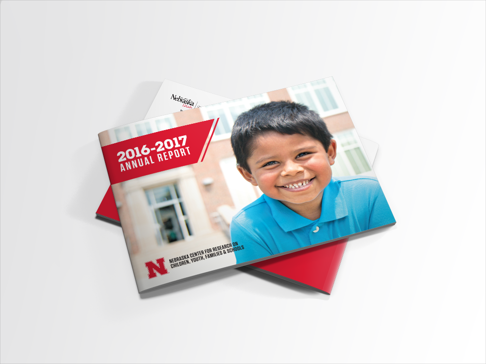
The 2016-2017 Annual Report for the Nebraska Center for Research on Children, Youth, Families and Schools, showcases the strides in research the center’s faculty and faculty-affiliates have conducted. The center strives to conduct, support and share this research with the community.
Strategically highlighting the photography to support the stories is of great importance to the overall layout of the report. Visually interesting and emotionally evocative photography helps draw in the reader to become invested in the story. The overall design is also influenced by an angle graphic that continues throughout the piece. It not only draws the eye of the reader, but also represents the center’s drive to be the leader in research that impacts lives.
Full report can be viewed here.
Flatwater Partners are a group of private investors with years of experience in the industry. The state's name, Nebraska, stems from an Oto word meaning "flatwater". The partners wanted to connect back to their common roots, and the logo reflects the theme of water with a stylized rendition of streams in a river.
A full stationery set was designed as well as a website for the new business. Photography of rivers was utilized to emphasize the business’s namesake. The lines within the logo can also be pulled out and used as a secondary design element for other materials.
A variety of projects for the 2017 Nebraska Tourism campaign "Through My Eyes". The campaign was inspired by the lives of Nebraskan’s across the state, showcasing the unique portions of Nebraska that they lived in through their own perspectives. This roused a sense of ownership and pride for the state.
Projects include the 2017 Spring/Summer Travel Guide, save the date for the Agri/Eco-Tourism Workshop, and banner ads that partnered with the Nebraska Huskers.
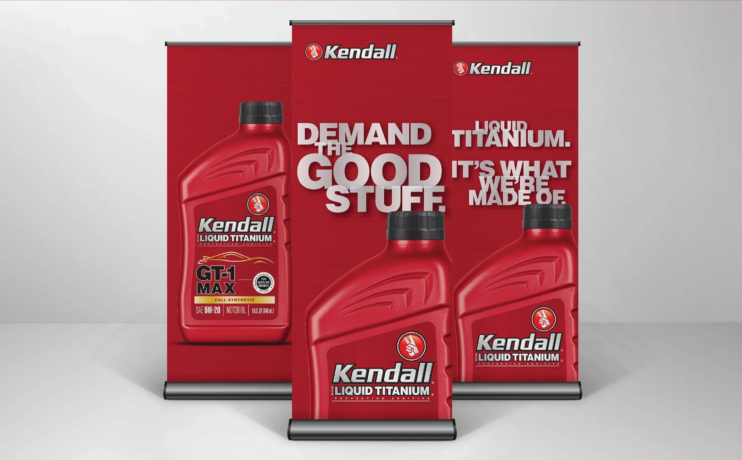
The following projects were marketing materials created for Kendall Motor Oil. These materials were designed for a conference setting that included other competitors in the market. Kendall was in the process of ushering in a new rebrand, and consistency across all materials was of high priority.
The final piece is a Mecum-Kendall marketing kit. The kit was designed to be sent out to Kendall marketers to help promote their partnership with Mecum Auctions. The kit contains a pen, koozie, notepad, t-shirt and magnet that lists the dates and location of each Mecum auction.
© Kendall Motor Oil
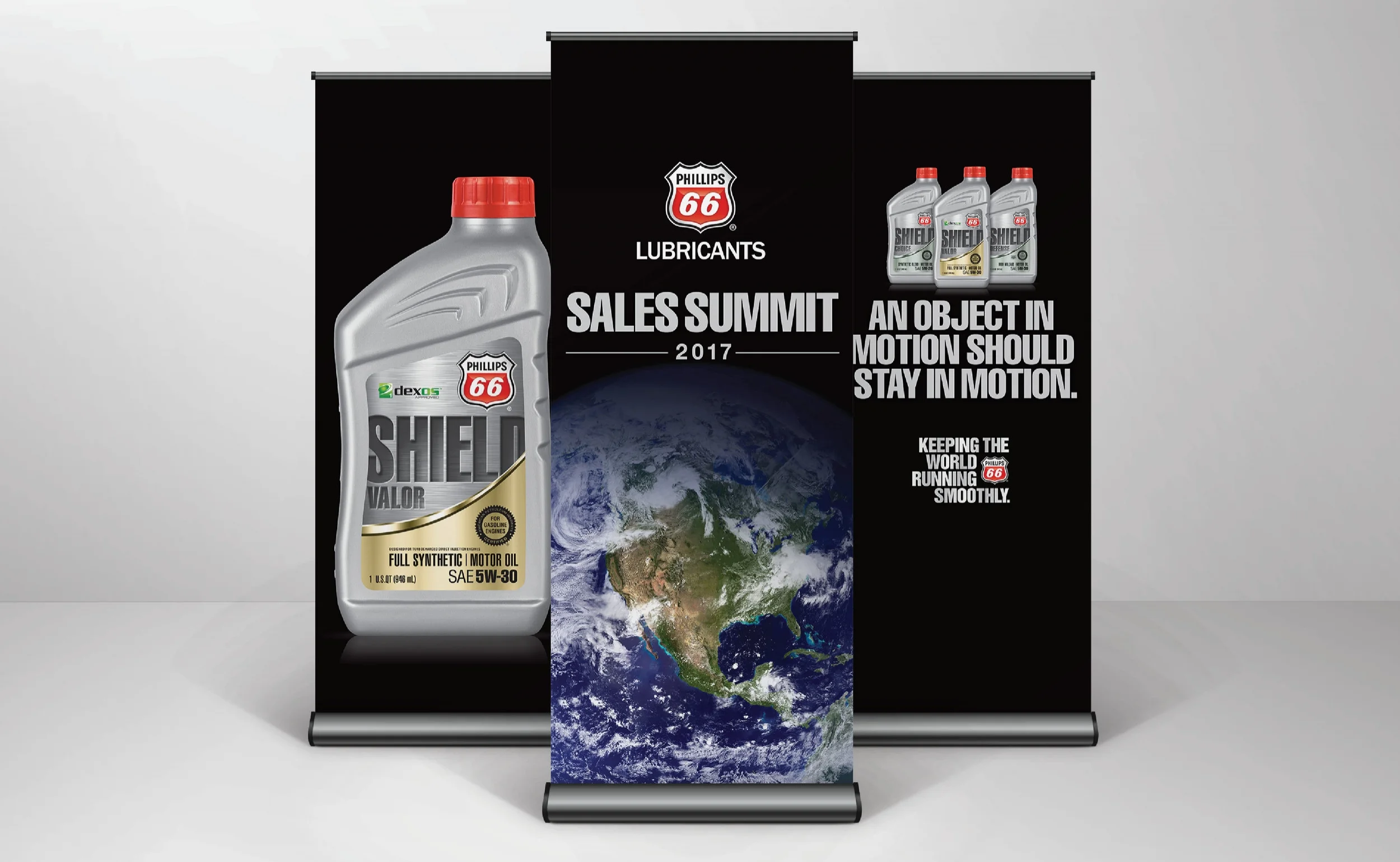
The marketing materials shown were designed for the 2017 Phillips 66 Sales Summit. Phillips 66 had also been recently rebranded and showcasing the new product lines was the goal for this summit. Phillips 66’s marketing materials let the product speak for itself with simple and streamlined layouts that highlighted the product and left a lasting message.
© Phillips 66 Lubricants
Schoolmate specializes in creating affordable student planners as well as other materials for classrooms. The age range for materials spans from pre-K through college. A key component of designing these materials is to make it visually engaging for the selected age group, as well as have a message that principals and teachers appreciate.
The following pieces are a variety of designs that encompass different age ranges. The first group are planners ranging from middle through high school, followed by student agendas. These designs were also utilized for folders.
The final project is the 2016 College Planners catalogue. The catalogue encompassed full product lines of planners, folders and agendas that were specifically designed to appeal to colleges.
© School Mate 2016
Rowe Sanctuary, owned and managed by the National Audubon Society, is a non-profit whose mission is to conserve and restore the Platte River ecosystem.
The sanctuary needed to update their window coverings to help prevent birds from flying into the windows. The perforated vinyl reduces glare from the outside, while visitors can still see through the windows from the interior of the building. Rowe sought a solution to their needs that would still be aesthetically pleasing for visitors and showcase the Sandhill Cranes that they are world famous for.
Each panel was designed to reflect “the day of a crane.” The day starts in the river, shifts to the fields for meals and then the cranes take skyward. All the day’s activities ultimately culminate to returning to the river for the night.
Pinnacle Predators is a simulated museum exhibit. The exhibit is designed to showcase the evolutionary adaptations of birds of prey. Each section focuses on an individual adaptation, such as eyesight, wing shape and talons. This information is carefully crafted to make it accessible for individuals who have little formal education in biology or ornithology. Supplementing the written information are illustrations that show particular evolutionary adaptations to aid in comprehension for the viewer.
The design of the exhibit is intended to bring together the elements of a museum and the natural environment that birds of prey inhabit. The information panels are suspended from the ceiling to create a sense of movement and flight.
No museum exhibit is complete without a gift shop. A small pedestal showcases a variety of items that could be purchased after seeing the exhibit, including t-shirts, key chains and a field guide.
“My Two Thumbs” is a re-envisioning of a family friend’s home made hot-sauce. Emphasizing the aspects of a home-grown small businesses was a prime strategy for the design. The concept was to combine hand made fibers like canvas and twine with an industrial aesthetic which suited the owner’s tastes.
Each sauce has a heat rating system, as well as a description of the flavor profile.
Received a 2015 Gold Addy from AAF Omaha.
This poster was designed for a student clinic hosted by the University of Nebraska at Kearney. High school students from across the state were encouraged to register for the honor band or choral clinics.
The overall design was influenced by 1920’s posters that utilized striking figures as well as large swaths of color. The conductor was the center of the design, allowing it to cater to either band or choral students.
The poster was then distributed to high schools via mail to invite prospective students for the musical workshop.
Awarded 2015 Silver Addy by AAF Omaha.